Creating Responsive Websites That Adapt Flawlessly to Any Resolution
What is Website Adaptation and Why It Matters for Your Business Success?

Have you ever visited a website on your phone and had to pinch and zoom just to read the text? It’s frustrating, isn’t it? This experience highlights the importance of what is website adaptation?. But what exactly does this mean, and why should your business invest in it? Let’s dive in!
Understanding Website Adaptation
Website adaptation refers to the process of modifying a website so that it displays correctly on various devices and screen sizes, ensuring an optimal user experience. This is crucial in today’s digital landscape because 58% of all web traffic comes from mobile devices. Thats a huge market you simply cant ignore!
Imagine you’re running an online store. If customers cant easily navigate your site on their smartphones, they may leave and go to a competitor. In fact, research shows that 61% of users are unlikely to return to a mobile site they had trouble accessing. This statistic should be a wake-up call! It’s not just about aesthetics; it directly impacts your business success.
Real-World Examples
- Think about Jane, an entrepreneur who sells handmade jewelry. She noticed that her website traffic spiked, but her sales didn’t budge. After adapting her site for mobile devices, she found that conversions rose by 35%, directly increasing her revenue.
- Or consider Tom, who runs a local bakery. His website was difficult to navigate on mobile. Once he hired a specialist from zuniweb.com to create a responsive design, he saw a 50% increase in online orders within a month!
Why Adaptation Matters
Investing in website adaptation goes beyond just making sure your site looks good. It also entails:
- Improving SEO performance: Google considers mobile-friendliness as a ranking factor. Thus, a well-adapted site is more likely to appear higher in search results.
- Enhancing user experience: When users can easily access information and shop online, they are more likely to stay engaged with your content. ⭐
- Boosting conversion rates: An optimized site has the potential to convert visitors into customers, significantly impacting your bottom line.
According to a recent study, companies that prioritize responsive design experience an average revenue uplift of 10% per quarter. That’s a compelling reason to act now!
The Cost of Not Adapting Your Website
What are the consequences of not addressing the responsive layout on your website? Here are some pitfalls:
- Loss of customers: If users struggle to navigate your site on mobile, they will likely abandon it for a competitor.
- Poor brand perception: A website that doesn’t function well can deter customers, making your brand appear outdated or unprofessional.
- Reduced reach: Inaccessible designs limit your market presence, preventing potential clients from discovering what you offer.
Cost Factors for Responsive Website Design
Now, you may be wondering, how much does a responsive website cost? The truth is, costs can vary greatly depending on the complexity of your site and the services you choose. At zuniweb.com, we offer a range of options:
| Service | Cost (EUR) |
| Landing Page Development with Custom Code | 2400 |
| Online Store Development on Wordpress | 11700 |
| Website Support - Standard Package (15 hours) | 600 |
| SEO Promotion - 30 Keywords | 1258 |
| Business Card Website Development on Wordpress | 4420 |
| Landing Page Development on Wordpress | 3120 |
| Catalog Website Development with Custom Code | 5600 |
| SMM Promotion - JUNIOR Package | 1718 |
| CRM System Development | 12000 |
| Google Adwords - Banner for Advertising | 140 |
With our 20 years of experience, our professionals will guide you through the process and ensure you get the best service possible. ⭐⭐ Ready to adapt? Call Alexandr at Go Telegram Chat or visit us at zuniweb.com to sign up today!
FAQs on Website Adaptation
- What is website adaptation? It’s the process of ensuring your site displays properly across different devices and screen sizes.
- What does responsive design mean? It means your website will adapt its layout and content based on the screen size of the device being used.
- For what resolutions should adaptation be done? Typically, it’s essential to consider resolutions for desktops, tablets, and mobile phones.
- How should a responsive website look? It should display well on any device, with readable text and easily navigable menus.
- What are the consequences of using a responsive layout on a website? The main advantages include improved user experience and increased conversion rates!
- How to check the responsiveness of a website? You can use tools like Google’s Mobile-Friendly Test or simply check how it looks on various devices.
- How much does a responsive website cost? Costs vary depending on site complexity; visit our service list for details!
- How will a responsive site help my business? It improves SEO rankings, captures more customers, and enhances overall user engagement.
- What should I do if my site isn’t responsive? Consider contacting a professional service to redesign your site to include responsive features.
- Will adapting my site take long? The timeline depends on your site’s current structure, but we ensure timely completion without compromising quality!
What Does Responsive Design Mean in Todays Digital Landscape?
contact us
Game apps can be really expensive to build and maintain, but don’t worry, we do everything in our mix to ensure that you get the best, for the best cost.
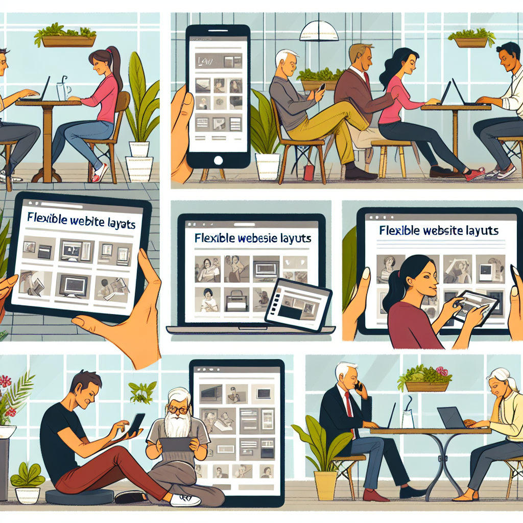
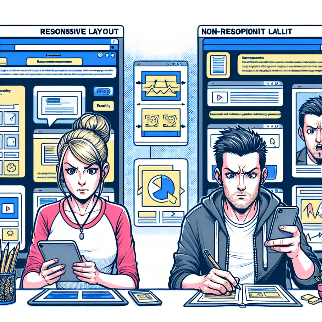
Have you ever tried to browse a website on your phone, only to find the text is too small and buttons too close together? ⭐ You click one and end up on a completely different page! This scenario drives home the importance of responsive design. Let’s unpack what this means and why it’s a pivotal factor in today’s online environment.
The Essence of Responsive Design
Responsive design is a web design approach aimed at creating sites that provide an optimal viewing experience across a wide range of devices. This means that whether your visitors are using a smartphone, tablet, or desktop computer, your website automatically adapts to fit the screen size. Your content remains accessible without the need to zoom in and out! ⭐
According to recent statistics, over 54% of global website traffic originates from mobile devices. Thats a significant portion of users who expect websites to perform well on their smartphones. If your site isn’t responsive, you could be missing out on a huge audience!
Real-World Examples
- Take Mia, a marketing professional. She recently revamped her agencys website with a responsive design. Not only did the site look sharp on every device, but she also saw a 40% increase in client inquiries within a month! ⭐
- Or consider Raj, who runs an online clothing store. His previous site was a nightmare on mobile, with items hard to navigate. After implementing responsive design, sales skyrocketed by 60% as frustrated mobile users became happy customers. ⭐️
Why Responsive Design Matters Today
Investing in responsive design is about much more than aesthetics. Here’s why it’s crucial:
- User Experience: A responsive site offers a seamless browsing experience. Users can easily find what they’re looking for, leading to higher satisfaction and retention rates.
- SEO Benefits: Google favors mobile-friendly sites, making responsive design a key factor for better search engine rankings. A well-optimized site can lead to increased organic traffic. ⭐
- Cost-Effectiveness: Building a single responsive site saves you the expense of maintaining separate sites for different devices. Plus, it’s easier to manage and update! ⭐
What Responsive Design Involves
You might wonder, what does responsive design actually involve? Lets break it down:
- Flexible Grids: Designs that use percentages for layout elements instead of fixed pixels to ensure scaling.
- Media Queries: These allow the website to apply different styles based on device characteristics like browser size
- Responsive Images: Images that resize within a flexible grid to ensure they aren’t too heavy on slower connections.
Cost Considerations for Responsive Design
Thinking about making the switch? You might be curious, how much does a responsive website cost? Prices vary, but investing wisely will pay off! Here are a few services we offer at zuniweb.com:
| Service | Cost (EUR) |
| Responsive Website Design | 4200 |
| Landing Page Development on WordPress | 3120 |
| Catalog Website Development | 7280 |
| Website Redesign | 2400 |
| SEO Promotion - 10 Keywords | 698 |
| Website Support - Start Package (10 hours) | 420 |
| Google Adwords - Initial Setup | 400 |
| Email Newsletter - Standard | 718 |
| SMM Promotion - MIDDLE Package | 2118 |
| Personalized Consultation | 300 |
With a team that boasts over 20 years of experience, we can bring your vision to life. Don’t let your website fall behind. ⭐ Ready to jump into the responsive revolution? Call Alexandr at Go Telegram Chat or visit our website at zuniweb.com to get started today!
FAQs about Responsive Design
- What does responsive design mean? It refers to a web design layout that adjusts based on the size of the user’s device.
- Why is responsive design important? It improves user experience, boosts SEO rankings, and can increase conversion rates.
- How do I know if my site is responsive? You can test it on various devices or use Google’s Mobile-Friendly Test tool.
- Do I need separate websites for mobile and desktop? No! Responsive design allows for a single site that works on all devices.
- What are media queries? They are a CSS technique that applies styles depending on device characteristics.
- How much time does it take to implement responsive design? It varies depending on your website’s complexity, but our experts ensure timely delivery.
- Is responsive design more expensive than traditional design? In the long run, it’s often more cost-effective because you maintain one site instead of multiple.
- Can I use responsive design for an existing site? Absolutely! We specialize in redesigning existing sites with responsive features.
- Will responsive design affect my search engine ranking? Yes, Google prioritizes mobile-friendly sites in search results!
- How often should I update my responsive design? It’s a good idea to review it every few years to keep up with changing technology and trends.
For What Resolutions Should Adaptation Be Done to Maximize User Experience?
contact us
Game apps can be really expensive to build and maintain, but don’t worry, we do everything in our mix to ensure that you get the best, for the best cost.

Have you ever tried to browse a website on multiple devices, only to find that it looks great on your tablet but is a nightmare on your smartphone? ⭐ This inconsistency can lead to frustrated users and missed opportunities for your business. So, what resolutions should you prioritize when considering website adaptation to maximize user experience? Let’s take a closer look!
The Importance of Screen Resolutions
In today’s digital landscape, users access the web through a myriad of devices, each with different screen sizes and resolutions. The most common resolution categories you should focus on are:
- Desktop Resolutions: Typically ranging from 1366x768 to 1920x1080 and even 4K (3840x2160). With the rise of widescreen monitors, ensuring compatibility with these variations can enhance the user experience significantly.
- Tablet Resolutions: Generally around 768x1024 (portrait) to 1536x2048 (landscape). Tablets are increasingly prevalent for web browsing, especially in casual settings.
- Mobile Resolutions: These resolutions can vary from 320x480 for older devices to 1440x2960 for high-end smartphones. Responsive design is essential here to ensure that users can navigate with ease. ⭐
Common Resolutions and Their Impact on Users
To optimize your website for the best user experience, focusing on the most widely used screen resolutions is key. Here’s a quick table summarizing the common resolutions:
| Device Type | Common Resolutions |
| Smartphone | 360x640 |
| Tablet | 768x1024 |
| Desktop | 1366x768 |
| Ultra-Wide Desktop | 2560x1080 |
| Retina Display | 1440x900 |
| 4K Desktop | 3840x2160 |
| Smart TV | 1920x1080 |
| Smartwatch | 240x240 |
| Gaming Console | 2560x1440 |
| VR Headset | 1920x1080 |
Strategies for Adaptation
Understanding the common resolutions is just the first step. Now let’s discuss how to adapt your website effectively:
- Flexible Layouts: Use fluid grids that allow elements on your page to resize proportionally, rather than sticking to fixed dimensions.
- Media Queries: Implement CSS media queries to apply specific styles based on device characteristics like width, height, and orientation.
- Scalable Images: Ensure that images can resize within their containing elements, maintaining clarity and quality without consuming excessive bandwidth.
- Hide or Rearrange Content: Use JavaScript or CSS to adjust which content is displayed or how its arranged based on device size. This ensures that users always have relevant information at their fingertips. ⭐
The ROI of Proper Adaptation
Investing in website adaptation for various resolutions not only enhances user experience but also impacts your bottom line. According to findings, businesses with mobile-optimized sites see up to 67% more leads than those that remain outdated. Can you afford to miss out on these opportunities? ⭐
When to Reassess Your Design
Technology is always evolving, and so are user habits. Here are some guidelines for when to reassess your responsive design:
- At least every year for major updates based on changing screen resolutions and device trends.
- After switching to a new CMS or platform, as this might alter how your website displays across devices.
- When you receive user feedback about navigation issues or when you see increased bounce rates from mobile users. ⭐
With 20 years of experience, our specialized team at zuniweb.com can help you adapt your website to meet these resolutions effectively. If you want to maximize user experience, don’t wait. Call Alexandr at Go Telegram Chat or visit our website to sign up today!
FAQs about Website Adaptation
- What resolutions should I focus on for my website? Aim for desktops (1366x768), tablets (768x1024), and mobile devices (360x640).
- What is the importance of flexible grid layouts? They ensure that your site scales seamlessly across all device sizes without losing design integrity.
- How do media queries work? They enable the application of specific CSS styles based on the characteristics of the device accessing the website.
- What are commonly overlooked resolutions? Many businesses forget about lower-end devices and smartwatches, which are gaining popularity.
- How can I test my sites adaptability? You can use tools like Google’s Mobile-Friendly Test or simply check your site on various devices.
- Can I adapt my existing website? Yes, a specialist can help make your current website responsive without starting from scratch!
- How much does it cost to adapt my website? Our flexible pricing starts fromas low as 2400 EUR for a complete redesign!
- What happens if I don’t adapt my website? You risk losing out on mobile traffic, impacting user satisfaction and ROI.
- Are there any ongoing costs for maintenance? Yes, we recommend regular assessments and updates to keep up with technological changes.
- What should I do if users report issues? Collect feedback, analyze data, and consider a review of your responsive design.
How Should a Responsive Website Look to Attract and Retain Customers?
contact us
Game apps can be really expensive to build and maintain, but don’t worry, we do everything in our mix to ensure that you get the best, for the best cost.
In a world where the attention span of web users is shorter than ever, having an appealing design for your responsive website isn’t just a nice-to-have; it’s a must-have! ⭐ So, how should a responsive website look in order to captivate and retain your customers? Let’s dive into the essential elements that make your site both attractive and functional.
The Visual Appeal
First impressions matter! A visually appealing website helps engage visitors. When thinking about design, consider the following:
- Color Scheme: Use a pleasing and consistent color palette that reflects your brand identity. Colors evoke emotions, and the right hues can create a positive experience for users. For instance, warm tones can create a welcoming atmosphere, while cool tones can evoke professionalism.
- Typography: Select fonts that are easy to read across different devices. A good rule of thumb is to use sans-serif fonts for body text and complement them with more adventurous fonts for headings. Ensure the font sizes adjust well on mobile to maintain readability. ⭐
- High-Quality Images: Use crisp, clear images that accurately depict your products or services. Quality visuals not only establish trust but also draw users in. Moreover, utilizing responsive images that adapt to different screen sizes is essential. ⭐️
Layout and Navigation
The layout plays a crucial role in user experience. Here’s how to ensure your visitors can navigate your site easily:
- Intuitive Navigation: A clean, simple menu layout helps users find what they’re looking for without confusion. Ensure your navigation bar is accessible with just a few taps on mobile devices. Think about including a “hamburger” menu to save space on smaller screens. ⭐
- Whitespace: Don’t be afraid of whitespace! It allows your content to breathe and makes it easier for users to digest information without feeling overwhelmed.
- Clickable Buttons: Ensure buttons are large enough for users to tap easily without misclicking. An ideal size is around 44px by 44px for mobile devices.
Content Strategy
Good content is the backbone of any successful website. Here’s how to make your content more engaging:
- Clear Messaging: Communicate your value proposition clearly and concisely on your homepage. Users should understand your offering within seconds of landing on your site.
- Engaging CTAs: Use compelling calls-to-action (CTAs) that guide users toward the next steps. Phrases like “Get Started,” “Sign Up Now,” or “Shop Today” can encourage users to take action. ⭐
- Additional Resources: Provide resources like blogs, FAQs, or tutorials to engage visitors further and position your brand as an industry authority.
Loading Speed Matters
Did you know that 53% of mobile users will abandon a website if it takes longer than three seconds to load? Speed is crucial in retaining users! Optimizing your website includes:
- Image Optimization: Ensure images are compressed without sacrificing quality to improve loading times.
- Minimizing Code: Reduce the amount of CSS and JavaScript, which can help speed up load times.
- Using a CDN: A Content Delivery Network (CDN) can distribute your website’s content closer to users to enhance loading speed.
Mobile Functionality
No discussion about responsive design would be complete without mentioning mobile functionality. Here’s what your responsive website should prioritize:
- Touch-Friendly Features: Ensure elements that require user interactions, like forms and buttons, are touch-friendly and easy to tap. ⭐
- Responsive Design Tests: Regularly conduct tests on various devices and resolutions to ensure the aesthetics and functionality remain intact.
- Accessibility: Your website should accommodate all users, including those with disabilities. Utilize alt text for images and ensure your site is navigable via keyboard.
Brand Consistency
Lastly, brand consistency boosts user trust. Always keep in mind:
- Consistent Branding: Maintain uniformity in logos, colors, and messaging across all pages to create a cohesive brand identity.
- Social Proof: Include testimonials, reviews, or case studies that highlight customer satisfaction and build credibility. ⭐
- Connect with Customers: Use chat support or feedback forms to engage with users, showing that you value their input and experience.
The Benefits of Effective Design
Investing in an attractive responsive design can pay off significantly. For example, businesses that prioritize user experience see an average increase of 18% in customer retention. Now, that’s a solid return on investment! ⭐
At zuniweb.com, we specialize in creating stunning responsive designs that not only look great but also enhance user experience. If you’re ready to transform your online presence, give Alexandr a call at Go Telegram Chat or visit our website to take the first step!
FAQs about Responsive Website Design
- What should a responsive website look like? It should have an appealing layout, intuitive navigation, and clear messaging that adjusts seamlessly across all devices.
- How important is mobile navigation? Extremely important! Mobile users make up over half of web traffic; navigation should be quick and efficient.
- What are effective CTAs? Compelling CTAs are direct and action-oriented, such as “Sign Up” or “Shop Now.”
- How can I improve loading speed? Optimize images, minimize code, and use a CDN for better performance.
- What is touch-friendly design? Touch-friendly design involves using easily tappable elements on mobile devices that enhance the user experience.
- What is brand consistency? It means maintaining uniformity in visuals, colors, and messaging across all platforms and devices.
- Why focus on accessibility? Making your website accessible ensures that all users, including those with disabilities, can interact with your site effectively.
- How can I test my responsive design? Use various devices and screen sizes to check functionality and aesthetics, or employ online tools for testing.
- Do I need to hire professionals for responsive design? While DIY options exist, hiring professionals ensures a polished and well-optimized final product.
- How often should I update my website design? Consider a redesign every few years, or sooner if significant changes in trends or technology occur.

Currently under development

Heroes Infinity: RPG + Strategy + Super Heroes
An epic action RPG packed with heroes, battles, and boundless adventure. Dive into the captivating world of Heroes of Infinity and embark on an unforgettable journey through cities and distant lands. Recruit powerful heroes, battle relentless enemies, and build your ultimate legendary team.
Experience seamless gameplay and captivating challenges. We blend smooth mechanics with dynamic pacing to ensure your adventure never slows down. Dive into an immersive world where every move matters — with rich visuals, responsive controls, and battles that push your strategy and skills.
RPG
mobile
strategy
Unity 3D