Mobile Versions vs. Adaptive Versions: Understanding Website Adaptation for Mobile Devices
What is the Difference Between the Mobile Version and the Adaptive Version of a Website?
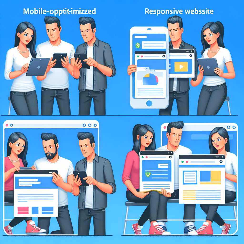
Have you ever browsed a website on your phone and wondered why it looks different than on your laptop? ⭐ That’s where understanding the difference between the mobile version and the adaptive version of a website comes into play. Both options aim to make your browsing experience smoother, but they do it in distinct ways.
Mobile Version: A Dedicated Experience
A mobile version of a website is specifically designed for mobile devices. It uses a different URL (like m.example.com) and typically offers a streamlined experience tailored for smaller screens. For instance, if you often visit an online store using your smartphone, you’re likely using its mobile version. This site is optimized to load quickly on cellular networks and adjusts the layout to fit smaller screens, removing extra elements that could clutter the experience. ⭐
Why Choose a Mobile Version?
- ⭐ Fast Loading Times: Mobile versions often load faster because they are less complex. This is essential, as studies show that 53% of mobile users abandon sites that take longer than three seconds to load.
- ⭐ Simplified Navigation: Fewer pages with concentrated content make it easier for users to find what they need quickly.
Adaptive Version: A Flexible Approach
An adaptive version, on the other hand, dynamically responds to the size of the screen being used. Rather than creating separate layouts, adaptive websites have several layouts and choose the most suitable one based on the user’s device. Imagine visiting your favorite news site; depending on whether youre on your phone, tablet, or desktop, the site will adjust accordingly. ⭐
Benefits of Adaptive Versions
- ⚙️ Versatile Layouts: Since adaptive sites are responsive, they can cater to a wider range of devices without the need for multiple URLs. This adaptability is great for SEO, as its easier to manage a single URL.
- ⭐ Better User Engagement: Research indicates that websites with responsive design can improve conversion rates by up to 36% because they offer a seamless experience across all devices.
Key Differences: Quick Reference Table
| Feature | Mobile Version | Adaptive Version |
| URL Structure | Different URL (m.example.com) | Same URL, different layouts |
| Design Complexity | Simple design | Multiple layout options |
| SEO Impact | Potentially negative due to duplicate content | Positive due to single URL |
| User Experience | Tailored for mobile only | Responsive across devices |
| Loading Speed | Usually faster on mobiles | Varies with the layout chosen |
| Maintenance | Separate maintenance required | Centralized maintenance |
| Target Audience | Primarily mobile users | All users |
| Content Display | Limited content | More comprehensive |
| Example | Facebooks mobile site | BBC News adaptive site |
Which Should You Choose?
So, which is better? It all depends on your business needs. If youre focused exclusively on mobile users, a mobile version might be ideal. But if you want a comprehensive solution that caters to all users, an adaptive version is likely the way to go. With over 50% of web traffic coming from mobile devices, making the right choice is crucial for engaging your audience. ⭐
At Zuniweb Studio, we have over 20 years of experience in providing top-notch IT services. Our professional specialists can help you navigate these choices and develop a website that meets your needs effectively. Ready to enhance your online presence? Contact Alexandr today at Go Telegram Chat or visit us at zuniweb.com! ⭐
Frequently Asked Questions- What is the adaptation of a website for mobile devices called? It is typically referred to as responsive or adaptive design.
- What is the size for a mobile version of a website? Theres no fixed size, but it generally aims for a width of around 375px to 480px.
- How do you create a version of a website for mobile devices? By using either separate mobile URLs or responsive frameworks like Bootstrap.
- What are the costs associated with adapting a website for mobile devices? Costs vary depending on complexity but can start from around 900 EUR for basic adaptations.
- How does a mobile version differ from an adaptive version? A mobile version is a separate site, while an adaptive version utilizes responsive designs to adapt to different screens.
- Is a mobile site better for SEO? Generally, a responsive site is preferred for SEO due to its unified URL.
- Do I need a mobile site if I have an adaptive version? Not necessarily; an adaptive site should suffice for various devices.
- Can I use the same content on both versions? Its advisable to avoid duplicate content between a mobile and desktop version.
- How often should I update my mobile website? Regular updates are advised, particularly for content and functionality.
- Will my mobile site load faster than my desktop site? Typically, yes, as mobile sites are streamlined for efficiency.
What is the Adaptation of a Website for Mobile Devices Called? Understanding Terminology
contact us
Game apps can be really expensive to build and maintain, but don’t worry, we do everything in our mix to ensure that you get the best, for the best cost.

When it comes to the digital world, the terms related to mobile adaptation can often feel like a language of their own. But what exactly do we mean when we talk about the adaptation of a website for mobile devices? Let’s break it down in a way that makes sense to everyone, whether you’re a tech guru or just someone looking to enhance your online presence. ⭐
Responsive Design: A Flexible Approach
One of the most common terms you’ll encounter is responsive design. This method involves creating a website that automatically adjusts its layout based on the size of the device used to access it. Imagine your favorite shopping site automatically re-arranging its contents when you switch from your tablet to your phone. With responsive design, the elements on the site flex to fit the screen smoothly, maintaining usability and aesthetics. ⭐
Key Features of Responsive Design:
- ⭐ Fluid Grids: The website layout is designed in relative units (like percentages) rather than fixed units (like pixels) so it can adjust to any screen size.
- ⭐ Media Queries: These are bits of code that let the website recognize the screen dimensions and adjust accordingly.
Adaptive Design: A Tailored Experience
Another important term is adaptive design. Unlike responsive design, which adapts dynamically, adaptive design involves setting up multiple fixed layouts that are tailored for specific screen sizes. Think of it like having various outfits made for different occasions. When you pick up your phone, the website recognizes it’s mobile and displays a layout optimized for your device’s size. This can lead to a more controlled user experience but requires more meticulous planning and testing. ⭐
Benefits of Adaptive Design:
- ⭐ Optimized Performance: Each layout can be fine-tuned for ultimate speed and usability on that specific device.
- ⭐ Improved Conversion Rates: With tailored experiences, adaptive designs can lead to higher user engagement and conversion rates.
Progressive Web Apps (PWAs): taking it a step further
Another modern approach to mobile adaptation is known as Progressive Web Apps (PWAs). PWAs offer a hybrid experience, combining the best of web and mobile applications. They load like regular websites but can inhabit a mobile devices home screen, send push notifications, and work offline. This adaptable framework means the user can enjoy a smooth experience regardless of network conditions. ⭐
What Makes PWAs Unique?
- ⭐️ Offline Functionality: Users can continue working even when theres no internet connection.
- ⭐ App-like Experience: They offer the same interactive experiences expected of native mobile apps.
Understanding Mobile-First Indexing
As you consider adaptation, it’s also crucial to be aware of mobile-first indexing. Google now uses the mobile version of a website for indexing and ranking. This means that if your site isn’t mobile-friendly, it could affect your visibility in search results. So, making sure that your site adapts well for mobile devices is more critical than ever! ⭐
Why Mobile-First Indexing Matters:
- ⭐ Improved Search Rankings: A mobile-friendly site is more likely to rank higher in search results.
- ⭐ Better User Experience: A focus on mobile also helps enhance the overall experience for users on all platforms.
Conclusion and Next Steps
Understanding these terms—responsive design, adaptive design, PWAs, and mobile-first indexing—can significantly impact how you view the adaptation of your website for mobile devices. Whether you’re planning to create a new site or improve an existing one, consider these concepts vital for building a successful online presence.
Need help navigating through these options? Reach out to us at Zuniweb Studio! With over 20 years of experience, our professional specialists are here to assist you in determining the best approach for your needs. Contact Alexandr at Go Telegram Chat or visit zuniweb.com today! ⭐
Frequently Asked Questions- What is responsive design? It’s a design approach that makes websites flexible, adapting to any screen size.
- What is adaptive design? It involves creating multiple fixed layouts for specific devices, providing tailored experiences.
- What are Progressive Web Apps (PWAs)? They combine features of web and mobile apps to offer a seamless experience across devices.
- Why is mobile-first indexing important? It ensures your website is ranked based on its mobile version, impacting search visibility.
- What are media queries? They allow CSS to apply different styles based on device characteristics like width and height.
- Do I need both mobile and adaptive versions? Typically, a responsive design suffices for most needs, but adaptive can be beneficial for specific applications.
- Can I convert an existing website to be mobile-friendly? Yes, with responsive design techniques or by creating a mobile version.
- What tools can help in mobile adaptation? Frameworks like Bootstrap or tools like Googles Lighthouse can assist with optimization.
- How do I know if my site is mobile-friendly? Use Googles Mobile-Friendly Test tool to evaluate your site’s performance.
- What is the cost of adapting my website for mobile? Costs can vary, starting from around 800 EUR depending on the complexity and needs.
How Do You Create a Version of a Website for Mobile Devices? A Step-by-Step Guide
contact us
Game apps can be really expensive to build and maintain, but don’t worry, we do everything in our mix to ensure that you get the best, for the best cost.

Are you ready to make your website mobile-friendly? ⭐ In today’s mobile-driven world, ensuring that your website performs well on mobile devices is essential. Luckily, creating a mobile version of your website doesn’t have to be overwhelming. Here’s a clear, step-by-step guide that will take you through the process like a pro! ⭐
Step 1: Evaluate Your Current Website
Before diving into the development process, assess your existing website. Here are a few questions to consider:
- ⭐ How does your website currently perform on mobile devices? You can use tools like Google’s Mobile-Friendly Test to identify potential issues.
- ⭐ What content is most important for your mobile users? Determine which pages and features are frequently accessed by mobile visitors.
Step 2: Choose Your Approach
There are several strategies for creating a mobile version of your website. Choose the one that aligns best with your goals:
- ⭐ Responsive Design: This option allows the website to adapt fluidly to any screen size, using CSS media queries to adjust layouts and styles.
- ⭐ Adaptive Design: If you prefer a more controlled approach, consider adaptive design, which serves different layouts based on device types.
- ⭐️ Mobile-Specific Site: Alternatively, you can create a separate mobile version of your site (like m.example.com) that caters specifically to mobile users.
Step 3: Optimize Your Layout and Design
Once you’ve chosen your approach, it’s time to get to work on the design. Some things to keep in mind:
- ⚙️ Simplicity is Key: Mobile users prefer streamlined designs. Use larger buttons, simple navigation, and easy-to-read fonts.
- ⭐ Prioritize Content: Identify essential content that must be visible without scrolling. Use clear headings and concise text.
- ⚡ Media Optimization: Compress images and videos to ensure fast loading times while maintaining quality. Remember, 47% of users expect a page to load in two seconds or less! ⭐
Step 4: Implement Touch-Friendly Features
Mobile users engage differently than desktop users. Consider the following to enhance the user experience:
- ⭐️ Touch Targets: Ensure that buttons and links are easy to tap. Aim for a minimum size of 44x44 pixels for touch targets.
- ⭐ Vertical Scrolling: Allow vertical scrolling instead of horizontal scrolling, which can be cumbersome on mobile.
- ⭐ Utilize Color and Contrast: Ensure your site is visually appealing and easy to read, even in bright outdoor conditions.
Step 5: Test Your Mobile Site
Before launching your mobile site, thorough testing is crucial. Here are some best practices:
- ⭐ Cross-Device Testing: Check how your site performs on various devices and operating systems (iOS, Android, etc.).
- ⚙️ Performance Checks: Use tools like Google PageSpeed Insights to evaluate load times and performance metrics.
- ⭐ User Feedback: Consider using beta testers. Gather insights from actual users about their experience navigating your site.
Step 6: Launch and Monitor
Once everything is set, go ahead and launch your mobile site! But your work doesn’t end here:
- ⭐ Monitor Performance: Use analytics tools to track user engagement and identify areas for improvement.
- ⭐ Regular Updates: Keep your content fresh and up-to-date. Regularly check your site’s performance and adapt to user needs.
- ⚠️ Stay Informed: Mobile technology is always evolving. Stay updated on best practices and emerging technologies for ongoing improvements.
Conclusion: Get Started Today!
Creating a mobile version of your website is an essential step towards enhancing user experience and attracting more visitors. Don’t hesitate to dive in! ⭐ If you need help with this journey, turn to the experts at Zuniweb Studio. With over 20 years of experience in creating mobile-friendly websites, our professional specialists are ready to assist you every step of the way. Reach out to Alexandr at Go Telegram Chat or visit us at zuniweb.com today! ⭐
Frequently Asked Questions- What is the best mobile approach for my website? It depends on your goals. Responsive design is widely recommended for its flexibility.
- How important is mobile optimization? Extremely important! Over half of all website traffic comes from mobile devices.
- Can I convert my existing website to a mobile-friendly one? Yes, you can redesign using responsive techniques or create a dedicated mobile version.
- What tools can help with mobile site testing? Use Google’s Mobile-Friendly Test, BrowserStack, or Device Mode in Chrome Developer Tools.
- Are separate mobile URLs bad for SEO? They can be, as they may lead to duplicate content issues if not managed correctly.
- How often should I update my mobile site? Regular updates are recommended to keep content fresh and maintain performance.
- What metrics should I monitor after launch? Look at user engagement, bounce rate, page load speed, and conversion rates.
- Can I use a single URL for both desktop and mobile? Yes, using responsive design allows for a single URL to cater to all devices.
- What are touch targets? Touch targets are buttons and links designed to be easily tapped on a touchscreen device.
- How do media queries work? Media queries are CSS techniques that apply styles based on screen size and orientation.
How Much Does it Cost to Adapt a Website for Mobile Devices? Budgeting for Your Project
contact us
Game apps can be really expensive to build and maintain, but don’t worry, we do everything in our mix to ensure that you get the best, for the best cost.

When considering how to make your website mobile-friendly, one of the first questions on your mind is likely: How much will it cost to adapt a website for mobile devices? ⭐ Understanding the financial aspects can help you budget effectively and ensure youre getting the best value for your investment. Let’s break it down step-by-step! ⭐️
Factors Influencing Website Adaptation Costs
The cost of adapting your website for mobile devices can vary widely based on several factors:
- ⭐️ Current Website Structure: If your existing website is outdated or complex, it may require more work to make it mobile-friendly, increasing costs.
- ⭐ Type of Adaptation: Whether you choose responsive design, adaptive design, or a separate mobile site will affect your budget. Responsive designs tend to be more cost-effective.
- ⭐ Custom Features: Additional features such as animations, e-commerce capabilities, or integrations can increase costs significantly.
- ⭐⭐ Development Expertise: Hiring experienced developers may come at a premium, but it often results in higher quality work and fewer future issues.
Estimated Costs for Different Approaches
While costs can vary, here’s a general breakdown of what you might expect for different types of mobile adaptation:
| Adaptation Type | Cost Estimate (EUR) |
| Basic Mobile Version | 800 - 1,500 |
| Responsive Design | 1,500 - 3,500 |
| Adaptive Design | 2,500 - 5,000 |
| Custom Mobile Features | 1,000 - 4,500 |
| Full Website Redesign with Mobile Adaptation | 5,000 - 15,000 |
Additional Costs to Consider
When budgeting for mobile adaptation, it’s essential to account for additional costs that might arise:
- ⭐ Ongoing Maintenance: Regular updates and maintenance can cost between 100-500 EUR per month depending on the complexity of your site.
- ⭐ SEO Optimization: Ensuring your mobile site is optimized for search engines can add another 200-1,000 EUR, depending on the extent of services you need.
- ⭐️ Content Creation: You may want to invest in professional content or imagery for your mobile site, which can range from 300-2,500 EUR based on the scope.
Understanding Return on Investment (ROI)
While the initial costs of adapting a website for mobile devices can seem daunting, consider the potential return on investment. Here are a few reasons why investing in mobile adaptation is likely worth it:
- ⭐ Increased Traffic: With more users accessing the web via mobile devices, a mobile-friendly site can significantly increase your site’s traffic.
- ⭐ Higher Conversion Rates: Improved user experience on mobile can lead to enhanced engagement, resulting in higher sales and lead generation.
- ⭐ Better SEO Performance: Mobile-optimized websites are favored in search rankings, boosting visibility and attracting more organic traffic.
Get Expert Help with Your Budget
At Zuniweb Studio, we understand that budgeting for mobile adaptation can be challenging. Our team of professional specialists has over 20 years of experience in creating mobile-friendly websites that yield results. Let us help you plan and execute your project with a budget that makes sense for you! Contact Alexandr at Go Telegram Chat or visit us at zuniweb.com to get started on your mobile adaptation journey today! ⭐
Frequently Asked Questions- How much does it cost to adapt my website for mobile? Costs can range from 800 EUR for a basic mobile version to over 15,000 EUR for full redesign.
- Why is responsive design usually cheaper? Because it uses a single layout to adapt to various screen sizes, it often requires less development time.
- Are there ongoing costs after the initial adaptation? Yes, budgeting for regular maintenance, SEO, and content updates is essential.
- How can I measure the ROI after mobile adaptation? Track website traffic, conversion rates, and other engagement metrics before and after implementation.
- Is it necessary to update my entire website for mobile? It depends on your current site’s performance; sometimes a simple mobile version suffices.
- Can I do the adaptation myself? While possible, its recommended to hire professionals for the best results.
- What if my budget is limited? Focus on the most critical elements that will significantly improve user experience.
- How long does it take to adapt a website for mobile? It generally takes a few weeks to a few months, depending on the complexity.
- What happens if I dont adapt my site for mobile? You may lose out on a significant portion of your audience and potential revenue.
- How often should I reassess my mobile site’s performance? Regularly, ideally every six months, to adapt to changing user needs and technology trends.

Currently under development

Heroes Infinity: RPG + Strategy + Super Heroes
An epic action RPG packed with heroes, battles, and boundless adventure. Dive into the captivating world of Heroes of Infinity and embark on an unforgettable journey through cities and distant lands. Recruit powerful heroes, battle relentless enemies, and build your ultimate legendary team.
Experience seamless gameplay and captivating challenges. We blend smooth mechanics with dynamic pacing to ensure your adventure never slows down. Dive into an immersive world where every move matters — with rich visuals, responsive controls, and battles that push your strategy and skills.
RPG
mobile
strategy
Unity 3D