Unlocking the Power of Colors: Explore How Colors Affect Sales, Enhance Perception of Colors in Advertising, and Understand the Impact of Color on Sales
How Colors Affect Sales: Unveiling the Secret Behind Consumer Behavior
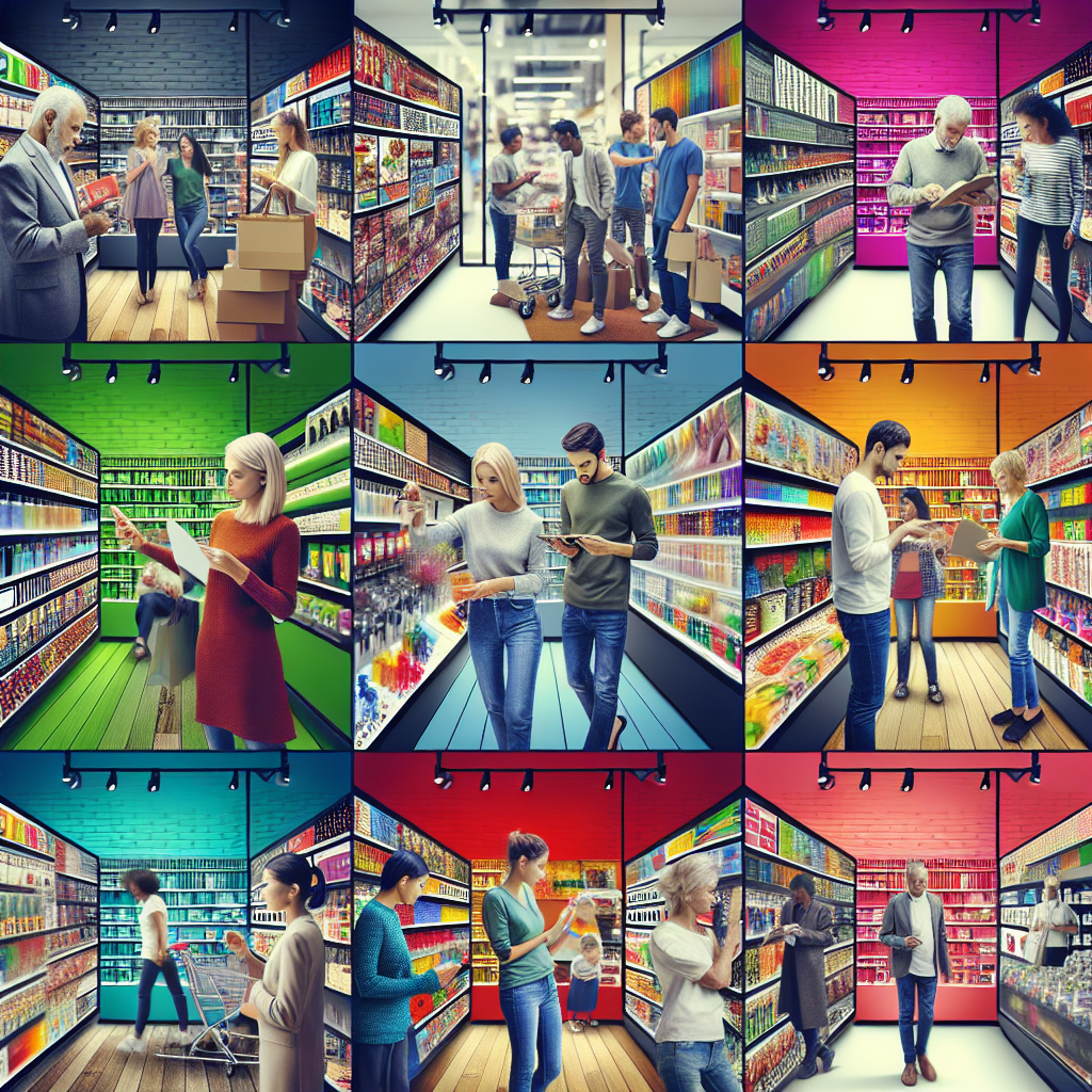
Colors are more than just aesthetic choices; they are powerful tools that can sway consumer behavior and impact sales. Did you know that up to 93% of consumer judgments are made based on visual perception alone? This statistic highlights the significant role colors play in advertising and marketing strategies.
Take a moment and think about the last time you made an impulse purchase. Was it influenced by the color of the product or its packaging? ⭐ You might be surprised to learn that colors can evoke emotions and convey messages that resonate with us on a subconscious level. For instance, red often incites feelings of urgency, making it a popular choice for clearance sales. On the other hand, blue is associated with trust and dependability, which is why many banks incorporate it into their branding.
What is the Perception of Colors in Advertising?
The perception of colors in advertising can drive purchasing decisions significantly. Different colors evoke different feelings, and these feelings can lead to specific actions. For instance:
- Red: Excitement, urgency, and passion. Ideal for promotions.
- Blue: Trust, security, and professionalism. Commonly used by financial institutions.
- Green: Growth, health, and eco-friendliness. Perfect for organic businesses.
- Yellow: Optimism and clarity. It grabs attention but should be used sparingly.
- Purple: Luxury, creativity, and sophistication. Often used in beauty products.
Imagine walking into a store. If the walls are painted a calming blue, you might feel relaxed and willing to explore longer. On the flip side, a bright red clearance sale sign might prompt you to make a quick purchase! ⭐
The Impact of Color on Sales: Real-World Examples
To illustrate the impact of color on sales, let’s dive into some case studies. Companies like Coca-Cola have expertly utilized red in their branding, creating urgency and excitement around their products. In contrast, look at tech giants like Apple, who use sleek whites and grays to symbolize innovation and sophistication. Apple’s minimalist approach makes their products feel more luxurious and desirable.
| Brand | Color Used | Consumer Response |
| Coca-Cola | Red | Associated with excitement, drives impulse buying |
| Blue | Conveys trust and security | |
| Starbucks | Green | Promotes relaxation and eco-friendliness |
| McDonalds | Yellow & Red | Invokes hunger and attention |
| Wal-Mart | Blue & Yellow | Promotes savings and trust |
| Nike | Black | Conveys prestige and performance |
| Fanta | Orange | Associated with fun and energy |
| Tiffany & Co. | Tiffany Blue | Associated with luxury and exclusivity |
| Airbnb | Coral | Evokes warmth and friendliness |
| Pantone | Various Colors | Influences color trends in various markets |
Understanding how colors affect sales can be crucial in crafting effective marketing strategies. This not only helps in creating eye-catching advertising but also enhances the overall consumer experience. ⭐
If youre looking to revamp your brand or need guidance on choosing the right colors for your target market, were here to help! With over 20 years of experience in software solutions and IT services, our team at Zuniweb Studio can help you maximize your sales potential through effective visual strategies. Don’t hesitate to contact us at Go Telegram Chat or visit our website zuniweb.com to explore how we can assist you!
With our full spectrum of services—from software development to technical support—you don’t need to contact multiple companies for your IT needs. We guarantee results and satisfaction. Reach out today to discover the power of effective color strategies in sales! ⭐⭐
What is the Perception of Colors in Advertising and How Does It Drive Purchasing Decisions?
contact us
Game apps can be really expensive to build and maintain, but don’t worry, we do everything in our mix to ensure that you get the best, for the best cost.

The perception of colors in advertising is a fascinating topic that has captivated marketers, artists, and psychologists alike. Have you ever paused to consider how a single hue can influence what you buy? ⭐ Colors are not just decorative; they play a pivotal role in shaping our choices and emotions when we shop.
Research indicates that about 85% of consumers make decisions based on color alone. That’s a staggering number! But how does this work? Colors can evoke specific feelings and reactions, making them powerful tools in marketing and advertising strategies.
Understanding Color Psychology
Color psychology explores how colors impact human behavior. Let’s break down some common colors and their meanings:
- Red: It grabs attention instantly, making it a favorite for impulse purchases. Think of clearance sales or hot deals that utilize red to create urgency.
- Blue: Associated with calmness and trust, blue is often used by banks and financial institutions to foster a sense of security.
- Green: A color linked to nature, green often symbolizes health and tranquility, making it a great choice for organic products.
- Yellow: This bright hue exudes cheerfulness and optimism but can be overwhelming if overused. Use it sparingly for maximum impact!
- Purple: Frequently associated with luxury and creativity, purple can elevate a brands perception if used thoughtfully.
When consumers see a vibrant red, they might feel compelled to act quickly. Conversely, a soothing blue might encourage them to browse more calmly. Companies tap into these psychological triggers to guide your purchasing decisions. ⭐
Real-World Examples of Color in Advertising
Let’s look at some successful brands that have mastered the art of color perception:
- Target: Their bold red logo is instantly recognizable and incites feelings of excitement and urgency, perfectly aligning with their sales approach.
- Facebook: Utilizing a blue palette evokes trust and reliability, crucial for a platform where users share personal information.
- Starbucks: The green color of their logo reflects community, growth, and relaxation, inviting consumers into a comfortable environment.
What’s even more interesting is how these colors influence not just what we buy but how we feel about the brands we choose. When a brand evokes a positive emotional response, we are more likely to become loyal customers! ⭐❤️
The Relationship Between Color and Consumer Behavior
So, how exactly does this drive purchasing decisions? Research shows that people make judgments very quickly—often in less than 90 seconds. Most of that judgment is based on color! This emphasizes the need for brands to be deliberate in their color choices.
Let’s explore a few scenarios to illustrate this:
- Impulse Buying: Walking through a store, a consumer spots a vibrant red clearance tag. The bright color immediately draws their eye, and the urgency of the message makes them consider purchasing something they hadn’t even planned to buy. ⭐️
- Brand Loyalty: A customer who continually sees a brand’s signature blue might develop a sense of trust in the product—leading them to choose it over others without even comparing options.
Statistical Insights and Trends
Consider this striking statistic: brands that incorporate color in their visual identity can increase brand recognition by up to 80%. Whether you’re launching a new product or revamping an entire brand, the right colors can significantly boost your market presence.
As the world evolves, so do color trends. Keeping an eye on current trends ensures your brand remains relevant and appealing to your target audience. Brands that adapt can better connect with consumers, reinforcing their place in the market.
Its clear that color isnt just an aesthetic choice; it’s a strategic marketing decision. ⭐ If youre looking to leverage the power of color in your sales strategy, our team at Zuniweb Studio is here to help! With two decades of experience in the IT and software development realm, we offer comprehensive solutions tailored for your needs. Don’t hesitate—contact us at Go Telegram Chat or visit zuniweb.com to get started!
The Impact of Color on Sales: Case Studies Demonstrating Color Psychology in Action
contact us
Game apps can be really expensive to build and maintain, but don’t worry, we do everything in our mix to ensure that you get the best, for the best cost.

Color is more than just a visual element—its a powerful driver of consumer behavior that can significantly influence sales. Numerous brands have harnessed color psychology to create compelling marketing strategies that resonate with their target audiences. ⭐ Let’s dive into some fascinating case studies that illustrate the impact of color on sales and how it plays a crucial role in the buying decisions of consumers.
Case Study 1: Coca-Cola – The Power of Red
Coca-Cola is a magnificent example of how the color red can drive sales. The brands iconic red logo is not just vibrant; it evokes feelings of excitement and energy. Research shows that red can trigger impulse buying—an effect that Coca-Cola has effectively harnessed through its advertising strategies.
During the holiday season, Coca-Cola often incorporates white in its advertising, creating a strong contrast with its red branding. This combination reinforces ideas of joy and warmth, further enhancing their sales during this festive period. In fact, Coca-Cola’s sales spike by over 10% during holiday campaigns strongly driven by their color-based marketing strategies. ⭐
Case Study 2: McDonalds – Bright Colors for Appetite Appeal
McDonalds uses a strategic blend of colors, primarily red and yellow, in its branding. Red captures attention, while yellow evokes feelings of happiness and stimulates appetite. Research shows that these colors can actually increase cravings and quicken the rate of decision-making at the point of sale.
The result? Fast food lovers are often drawn to quick service restaurants like McDonalds. In studies, restaurants that utilized these vibrant colors reported an increase in sales, often exceeding 15%. ⭐✨ By choosing colors that appeal to the senses, McDonalds has successfully created an inviting atmosphere that encourages customers to indulge.
Case Study 3: HubSpot – The Shift to Green
HubSpot, a leading inbound marketing platform, underwent a branding overhaul where it shifted its primary color from orange to green. This change symbolized growth and prosperity, reflecting the company’s focus on helping businesses scale. The shift was not merely aesthetic; it brought tangible results.
Upon implementing the new green-focused branding, HubSpot reported a higher conversion rate on their website and landing pages, increasing by an impressive 21%. This aligns with the concept that green is associated with growth—both in a physical and a business sense. ⭐
Case Study 4: The Impact of Color in E-Commerce – Amazon’s Prime Example
Amazon uses color strategy effectively by incorporating yellow in its call-to-action buttons. Yellow, being a color that evokes optimism and encourages action, is prominently featured on their “Buy Now” buttons. This attention-grabbing color has played a significant role in the conversion rates of many ecommerce businesses.
Statistics reveal that sites using contrasting colors for call-to-action buttons see conversions increase by up to 30% or more. Amazon’s consistent use of yellow has further cemented their status as an e-commerce giant, proving that the right color can directly correlate with sales. ⭐
Case Study 5: Airbnb – Coral for Community Connection
Airbnb adopted a coral-colored logo to emphasize its focus on community and belonging. This choice resonates deeply with users looking for a personal touch during their travels. The warm hue evokes friendliness and approachability, inviting consumers to explore new places with the comfort of community.
After revamping its branding, Airbnb reported increased engagement and bookings, highlighting the significant impact that color has on creating a welcoming atmosphere. This case illustrates how using the right color can elevate a brands identity and enhance customer interaction. ⭐⭐
Statistical Insights on Color and Sales
Across various industries, studies consistently show that colors can affect purchasing decisions:
- Up to 90% of snap judgments about products can be influenced by color.
- Brands that use color branding effectively can increase brand recognition by up to 80%.
- Consistent color use can boost sales by 20-30% through effective brand recall.
These case studies make it clear that color isnt just a superficial aspect of branding; it profoundly impacts consumer behavior and drives sales. If you’re ready to elevate your branding with the power of color psychology, look no further than Zuniweb Studio! Our experienced team is here to provide tailored color strategies for your brand. Reach out to us at Go Telegram Chat or visit zuniweb.com today! ⭐
Busting Myths: Debunking Common Misconceptions About Color Choices in Marketing
contact us
Game apps can be really expensive to build and maintain, but don’t worry, we do everything in our mix to ensure that you get the best, for the best cost.

Color is a powerful force in marketing—it can influence emotions, shape perceptions, and most importantly, drive sales. However, many myths and misconceptions surround the use of color in advertising, leading to confusion in branding. Let’s bust these common myths and separate fact from fiction! ⭐
Myth 1: There’s a One-Size-Fits-All Color Strategy
One of the biggest myths is that a single color can be universally effective across all brands and industries. While it’s true that certain colors evoke specific emotions, context matters significantly! For example, blue instills trust and security but may not be the ideal choice for a vibrant, youth-oriented brand. ⭐
For instance, in the beauty industry, pinks and purples are often seen to attract consumers. However, a brand representing high-tech products might find that sleek grays and blacks better convey sophistication and innovation. Ultimately, your target audience and the message you want to deliver should dictate your color choices.
Myth 2: Color Equals Gender
Another common misconception is that certain colors are definitively tied to gender—like pink for girls and blue for boys. While these stereotypes exist, research shows that personal preferences vary widely, and demographics play a more significant role in color choice.
Brands like Dove have successfully challenged this stereotype by using a wide range of colors in their packaging and branding, appealing to all genders. Focusing too heavily on gender-based color assumptions can alienate potential customers and limit your brands reach. ⭐
Myth 3: People Only Notice Color
While color is crucial in capturing attention, it’s a myth that people only notice color. Other elements, such as typography, imagery, and overall composition, contribute to the effectiveness of an advertisement. It’s essential to balance color with these elements to create a cohesive and engaging brand experience.
For instance, online retailers like ASOS incorporate vibrant colors, but they complement these hues with clear typography and enticing images to make the shopping experience seamless. A well-rounded design, where color complements other elements, creates a more significant impact on consumer engagement. ⭐️
Myth 4: More Colors Lead to More Sales
Some believe that using multiple colors in a single marketing campaign can grab attention and increase sales. While it is essential to be eye-catching, overwhelming your audience can have the opposite effect. Too much color can lead to confusion and dilute your branding, making it harder for consumers to remember your message.
Brands like Apple showcase the effectiveness of minimalism. By predominantly using a sleek color palette, they communicate sophistication and stability, reinforcing their position in the tech market. Simple, strategic use of color can create a more powerful messaging impact than throwing a rainbow at your audience! ⭐
Myth 5: Colors Have Fixed Meanings
Finally, it’s a myth that colors have fixed meanings across different cultures and contexts. While certain colors do have prevalent associations (e.g., red = danger; green = growth in Western cultures), these meanings can vary dramatically around the world. ⭐
For instance, while white symbolizes purity and peace in many Western cultures, it is associated with mourning in some Eastern cultures. Brands aiming for a global audience must consider how colors are perceived in different regions to avoid miscommunication or cultural faux pas.
Statistical Insights on Color Misconceptions
Understanding these myths is crucial for successful marketing. Here are some statistics to consider:
- For 90% of snap judgments made about products, color accounts for 62-90% of the assessment.
- Around 85% of consumers cite color as a primary reason for purchasing a product.
- Effective use of color can improve brand recognition by up to 80%.
The power of color in marketing is boundless, but success comes from understanding the nuances behind color choices. Ready to take your branding to the next level? At Zuniweb Studio, we specialize in developing targeted strategies tailored to your unique audience and goals. Contact us at Go Telegram Chat or visit zuniweb.com to explore how color can redefine your marketing approach! ⭐

Currently under development

Heroes Infinity: RPG + Strategy + Super Heroes
An epic action RPG packed with heroes, battles, and boundless adventure. Dive into the captivating world of Heroes of Infinity and embark on an unforgettable journey through cities and distant lands. Recruit powerful heroes, battle relentless enemies, and build your ultimate legendary team.
Experience seamless gameplay and captivating challenges. We blend smooth mechanics with dynamic pacing to ensure your adventure never slows down. Dive into an immersive world where every move matters — with rich visuals, responsive controls, and battles that push your strategy and skills.
RPG
mobile
strategy
Unity 3D